Summary
I've designed scores of interfaces for the clear visualization of large data sets, including recent dashboards for Covid-19, election analytics and cybersecurity data. In a time of overlapping political, technological and environmental challenges, using advanced UX techniques to tell a compelling, well-sourced data story is more important than ever.
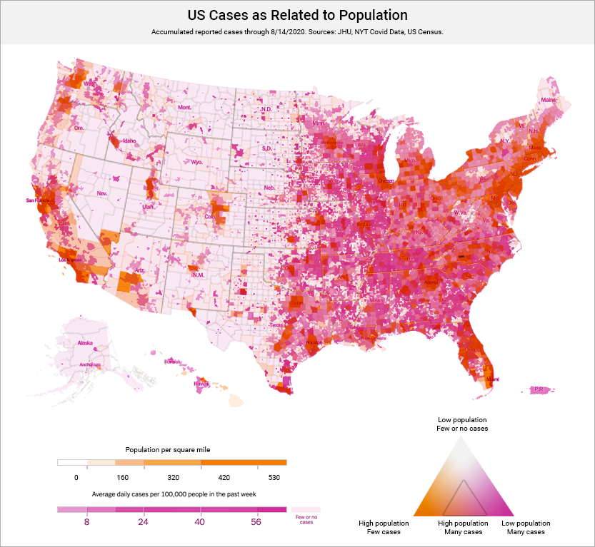
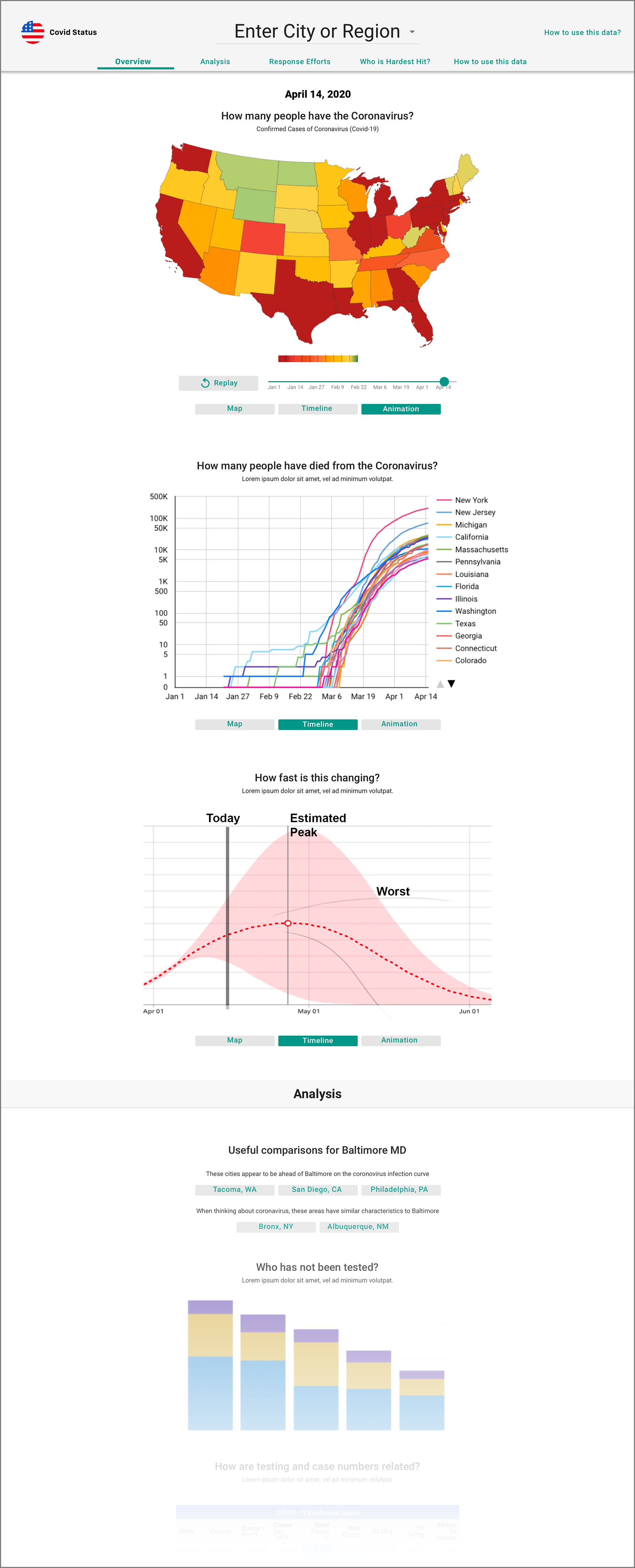
Novel Covid-19 Displays
Visually balancing multiple data sets to surface life-saving insights to a nation and planet under adversity. Note: these snapshots of an interactive dashboard show data from August 2020.
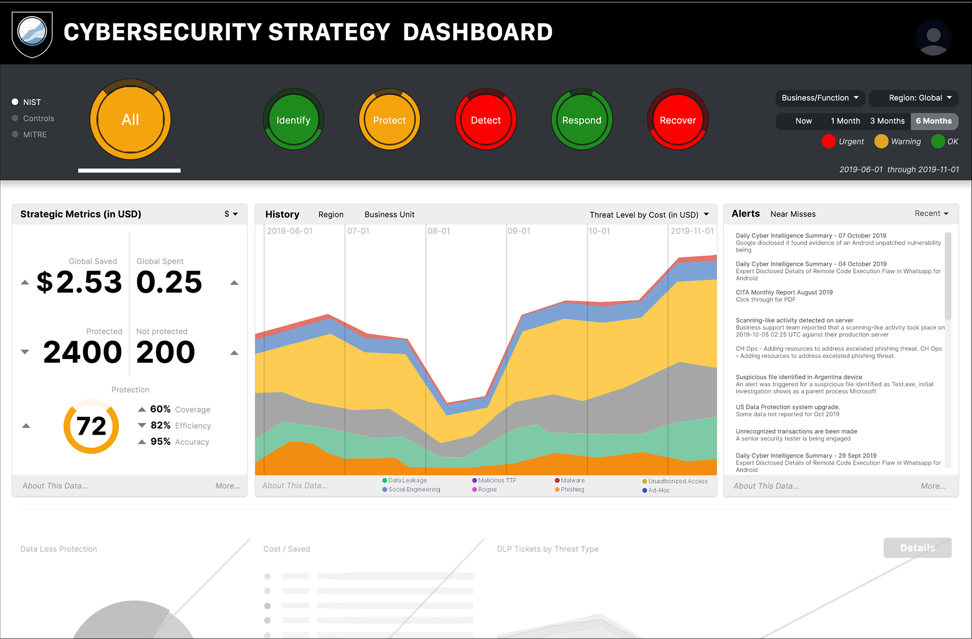
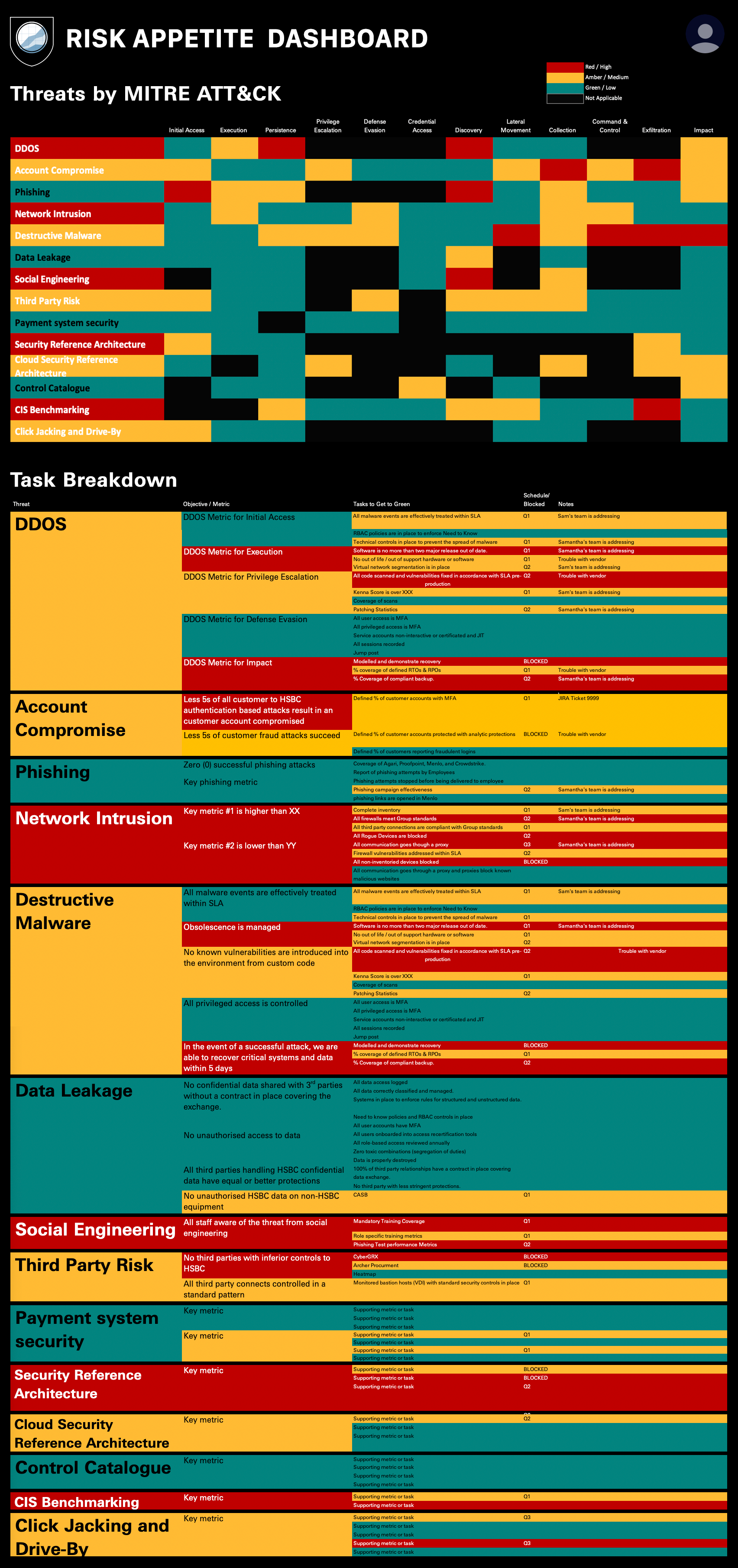
Interactive CyberSecurity Dashboard
Displaying rollups from a vast quantity of heterogenous data to ascertain risk and weigh priorities for a large global financial institution. Note: these interactive designs show example data with fictional attack scenarios.
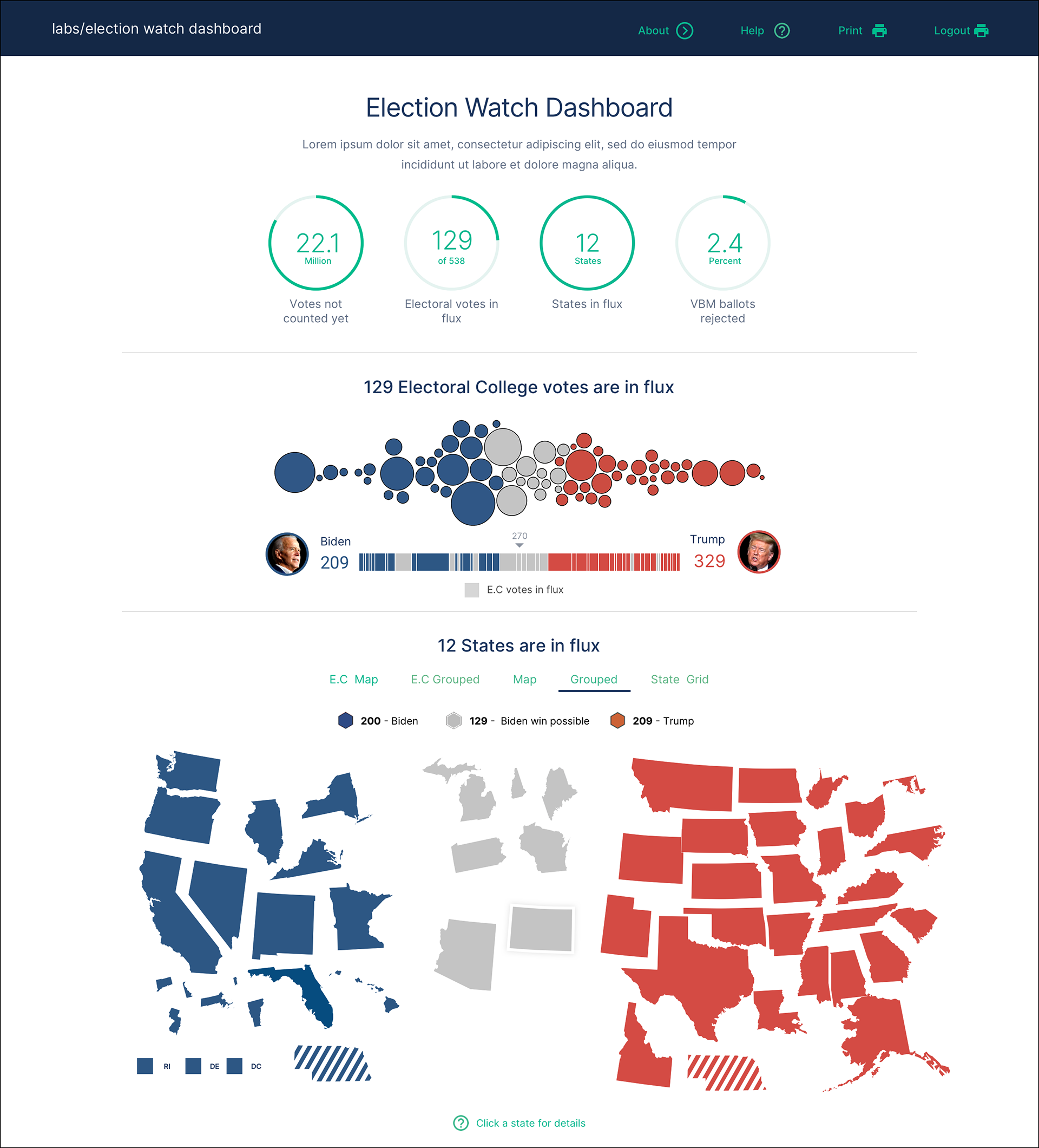
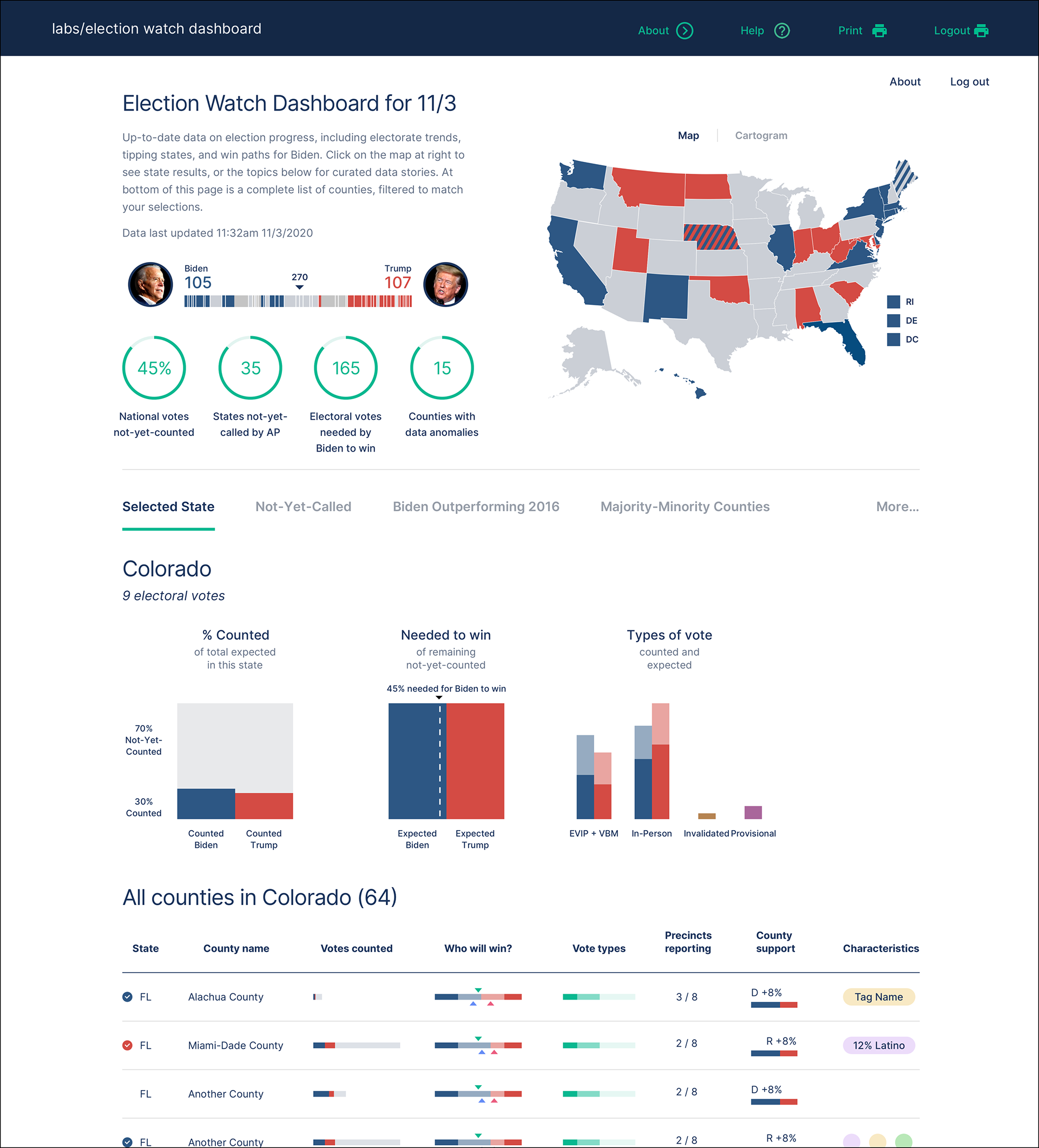
Election Dashboards
Reporting public and proprietary analytics for the 2020 election season. Note: these prototype designs use example scenario data.